Digital evidence retieval for business registration
Project background
Filling out online forms requires users to enter their personal data over and over again. Frequently, this data already exists in digital form, for example in the population register or the commercial register. However, the infrastructure needed to retrieve and use this data is missing.
In the future, the "National-Once-Only-Technical-System" (NOOTS) is intended to enable authorities to retrieve electronic evidence directly from registers.
Project goal
As part of the MVP, the connection between the Wirtschaftsserviceportal.NRW and the commercial register was established and tested. Success was defined by retrieving an extract from the commercial register digitally and transferring the data into the online business registration form.
MVP scope
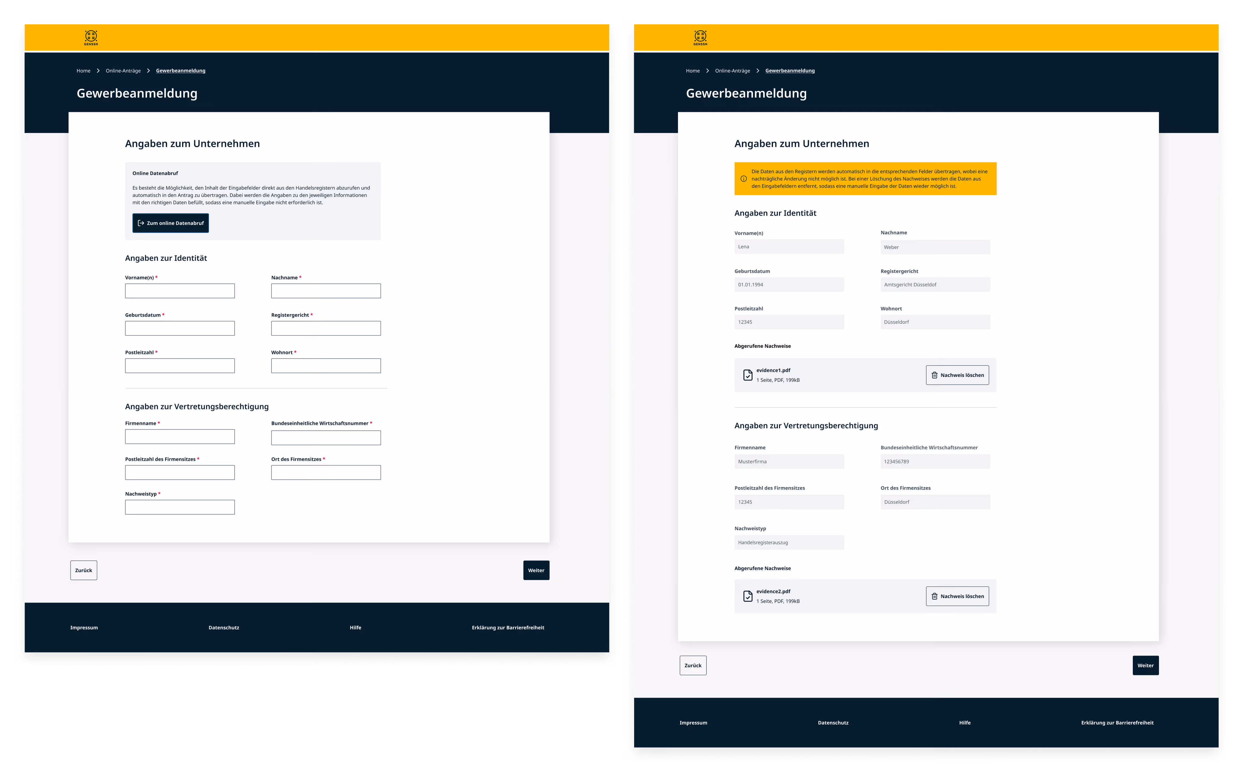
An existing company wishes to open a branch office. This still requires a business registration, which must be supported by a commercial register extract. Currently, this extract must be manually uploaded as a PDF, and the corresponding application fields must be completed by hand. By linking the business registration form to the register, the following will be possible in the future:
- Users can retrieve the commercial register extract directly and transfer it into the application.
- Relevant application fields will be automatically prepopulated with verified data from the Commercial Register.
- The commercial register rxtract will be attached to the application as a PDF without the need for a manual upload.
My role
I worked as a UX designer in close collaboration with developers and managers on the development of the product. My tasks included:
- Identifying optimization potential for the user journey through usability testing.
- Preparing, conducting, and evaluating usability tests.
- Developing high-fidelity prototypes and mockups.
- Migrating the interface to the KERN design system while adding custom components not covered by the standard library.
Project Constraints
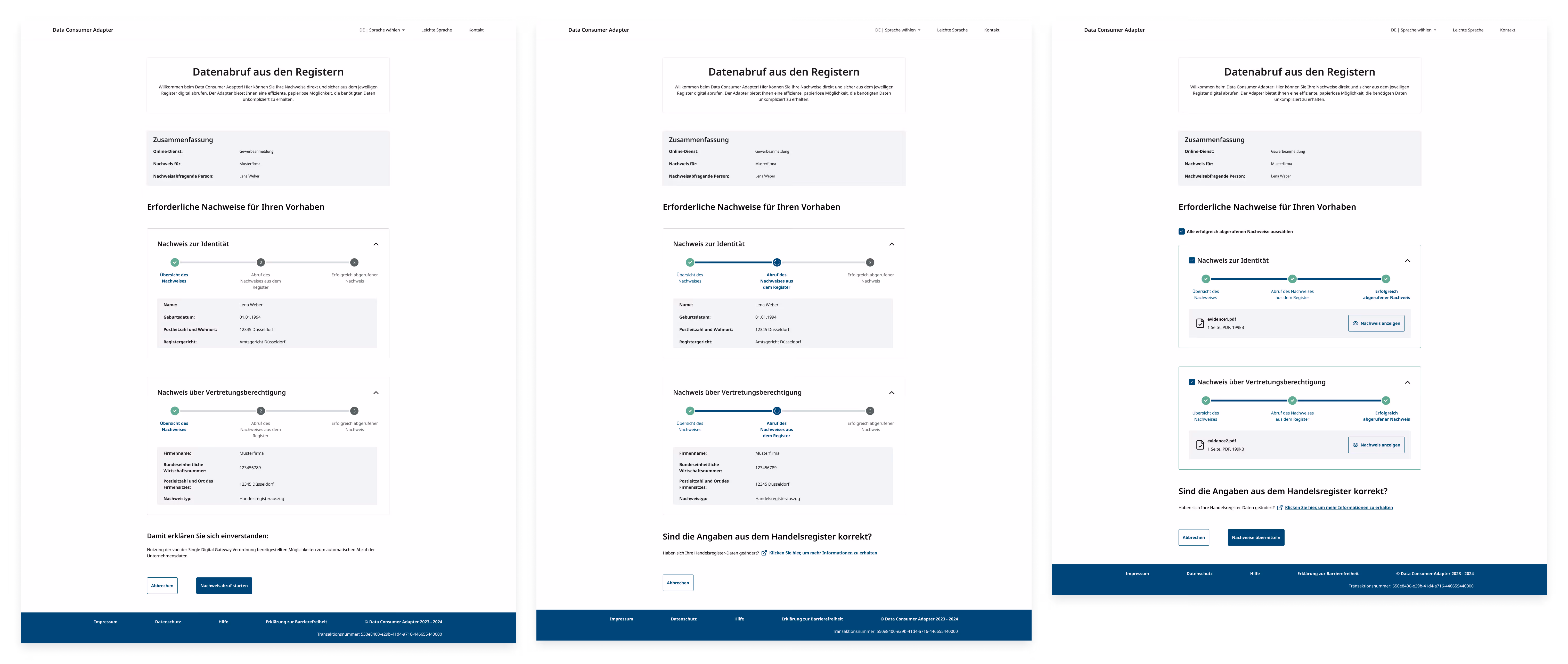
The retrieval process was designed to be generic and utilizes a specialized adapter called the Data Consumer Adapter (DCA). This adapter is built to potentially link any online application with any register to retrieve various types of evidence.
In practice, however, this architecture causes a break in the user flow: users must navigate away from the actual application into the adapter, perform the retrieval there, and then return to their application.
As the online business registration form could not be fundamentally modified for this test case, only a jump-off point to the DCA was implemented.
It was decided to apply the KERN Design System for the MVP. KERN is establishing itself as the new design standard for German public administration. Utilizing this design system also simplified the potential reuse of the solution by other federal states.
KERN is provided as pure HTML/CSS. As part of the project, publicplan developed a React implementation and made it available to the community.
The KERN Design System includes explicit recommendations for component usage. These were followed in most cases during the MVP design process.
Preliminary Project
Before the MVP phase, the evidence retrieval process was tested in a preliminary project through usability testing with internal participants. This test yielded the following key insights:
- Participants managed the basic retrieval process well. However, the jump-off point to the DCA was easily overlooked.
- The design of the success message following the data transfer did not fully meet user expectations.
- The metadata for individual pieces of evidence was placed prominently within the cards, but participants paid little attention to it.
- Participants repeatedly tried to expand or collapse the evidence cards, even when all information was already fully visible.
- The checkboxes within the cards were frequently missed.
- Loading processes were displayed within the cards but were visually lost.
Happy Path
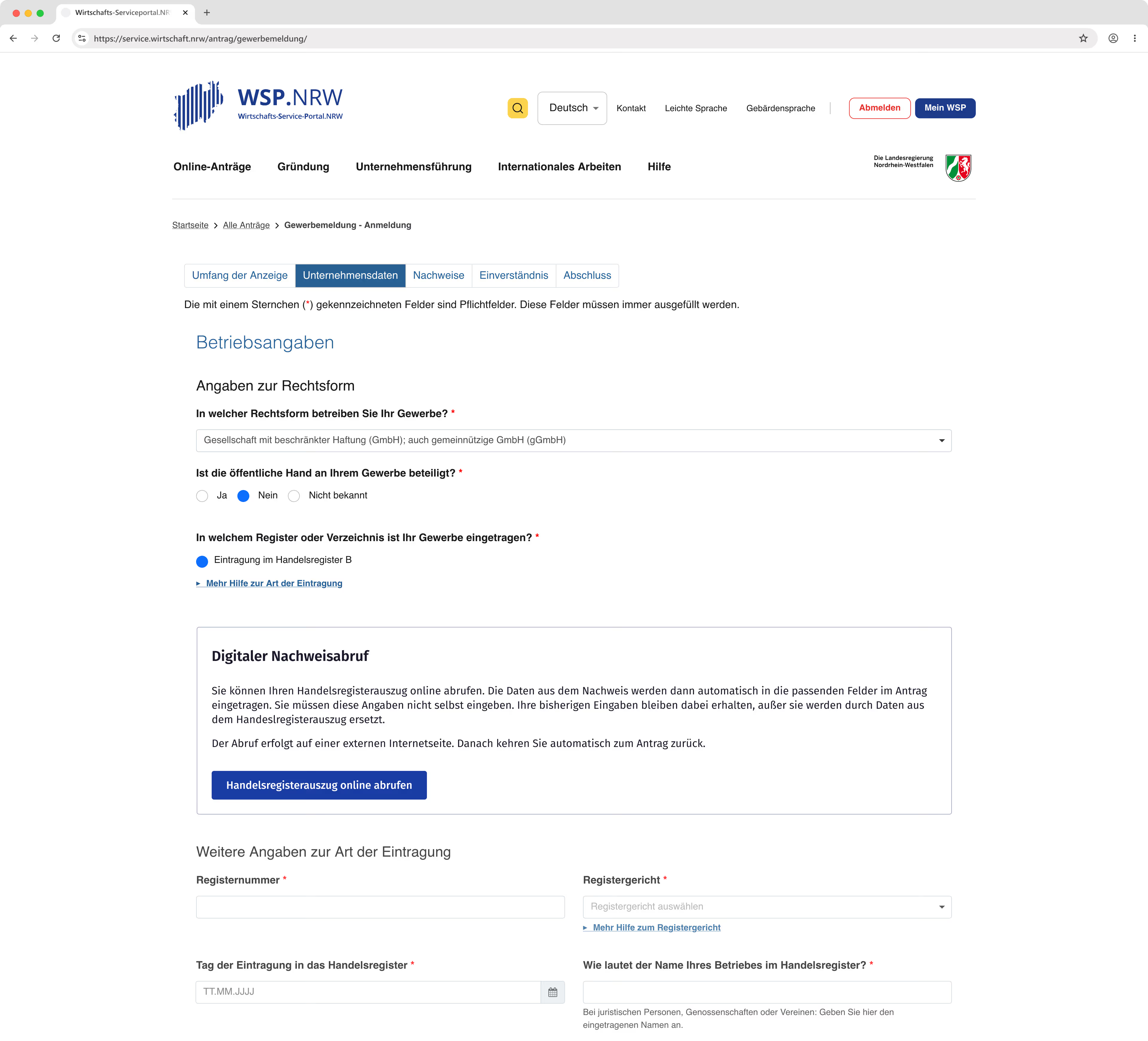
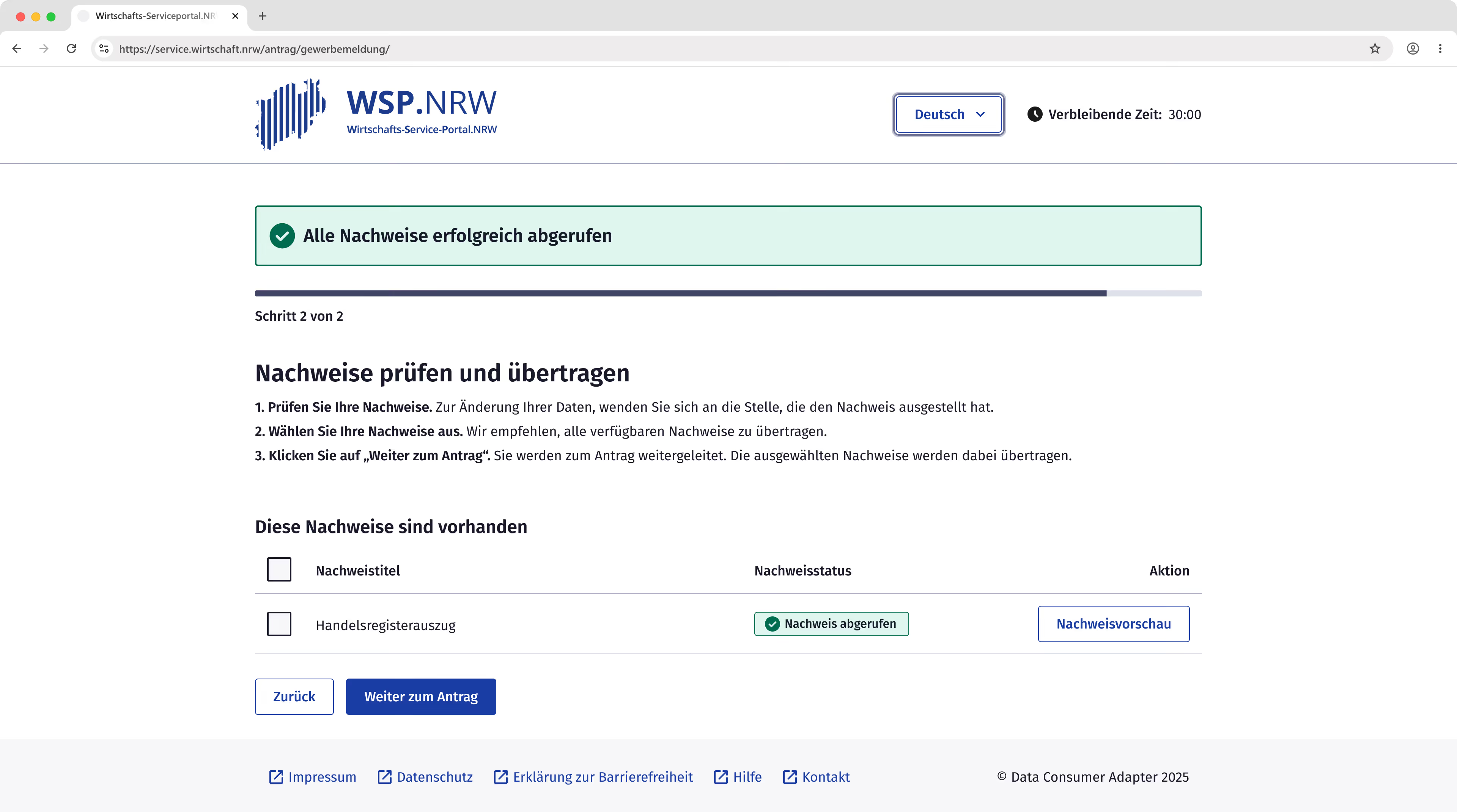
A jump-off point was placed in the application above the fields for the commercial register extract. There, users receive brief information about what to expect and how the retrieval process works.
Previous usability tests and interviews showed that data loss in long, complex applications was a major source of frustration. For this reason, it is explicitly pointed out that no data will be lost and that the user will be automatically returned to the application.
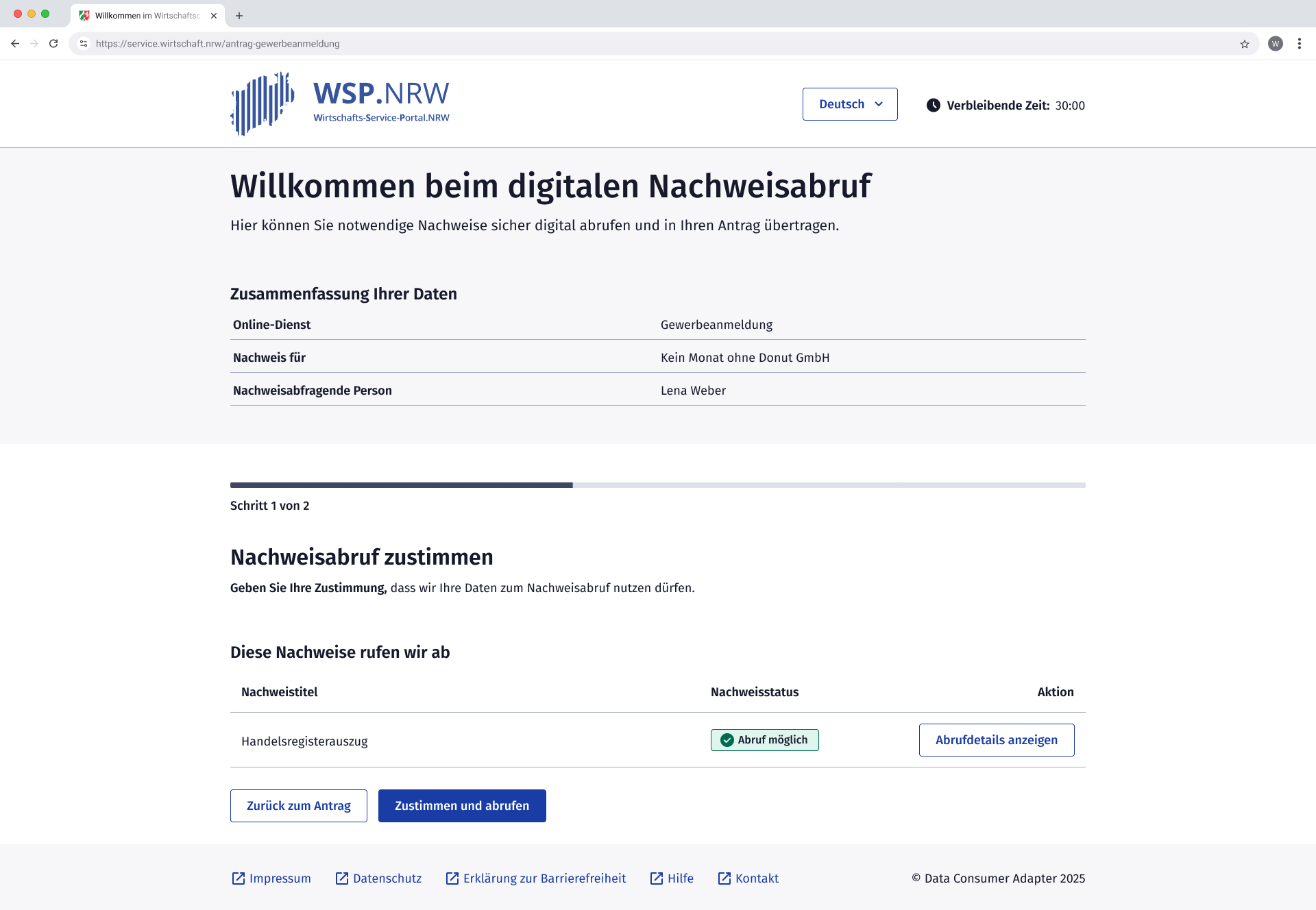
The header section of the evidence retrieval interface includes a greeting and a brief explanation of the service. Additionally, users can verify that they are retrieving the commercial register extract for the correct company.
A global progress indicator is located in the content area, providing users with concise instructions on the tasks required for the current step.
The evidence is displayed compactly in a table, showing the document title, status, and any available actions. Users consent to the retrieval and initiate the process simultaneously via a single button.
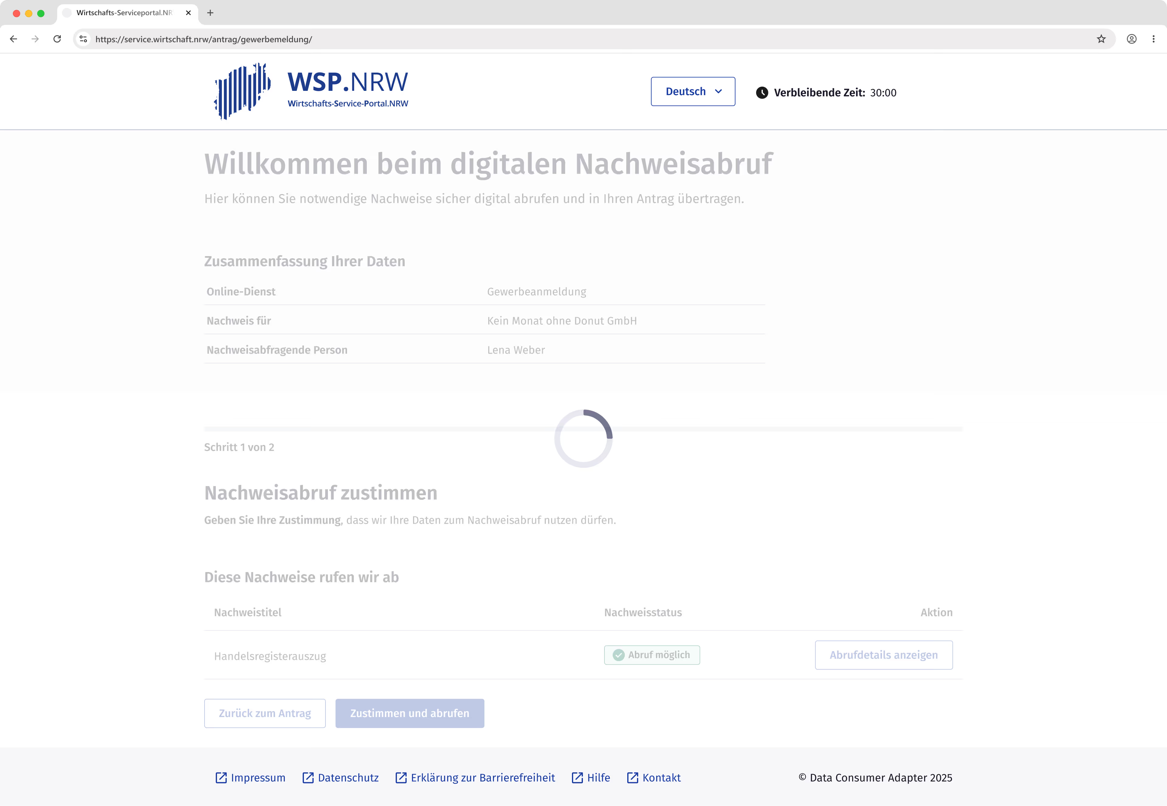
During the loading process, a loader is overlaid across the entire content area in accordance with KERN recommendations.
The loading screen remains active for a predefined maximum duration.
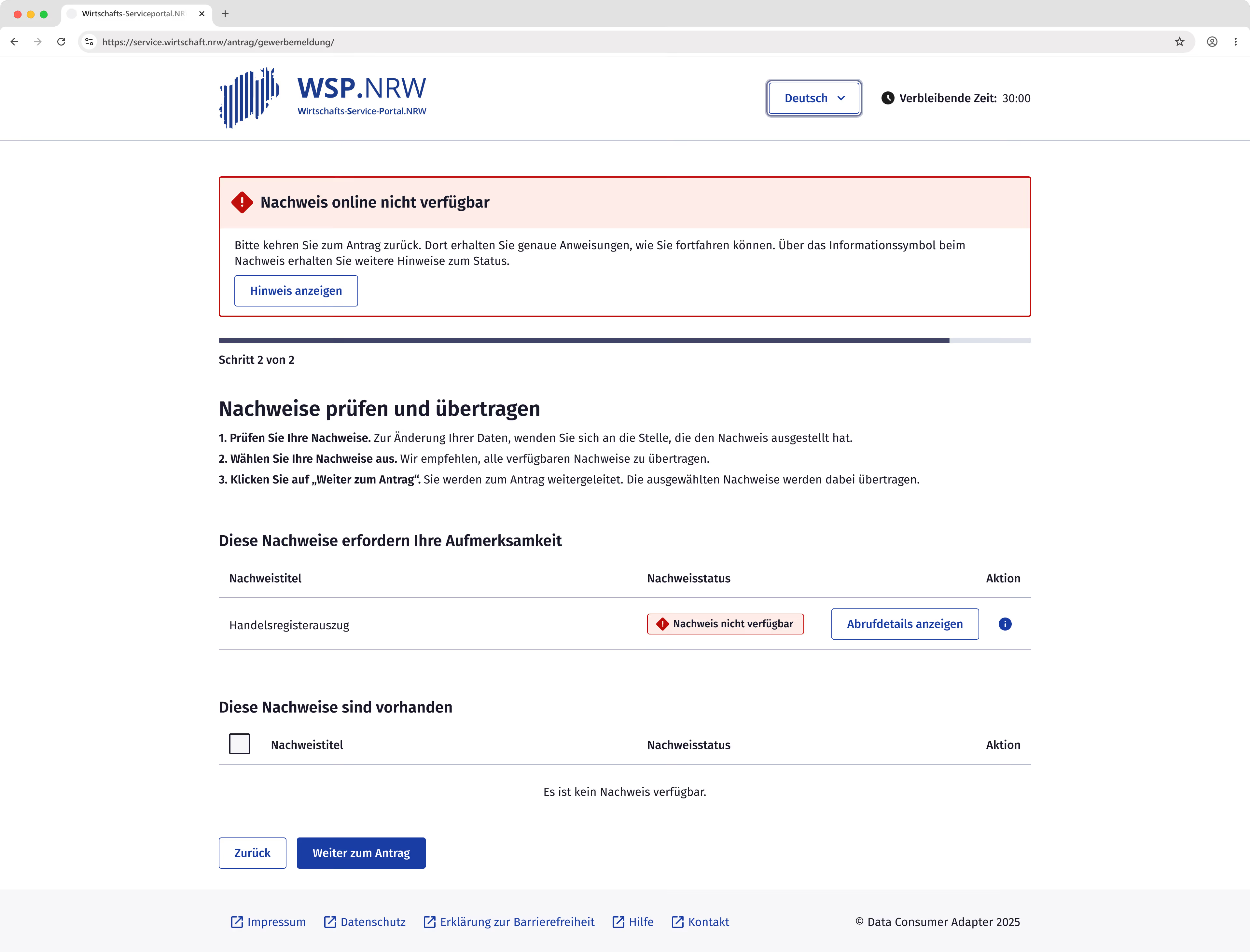
If this time limit is exceeded, the system automatically transitions to the next step, where users receive detailed information regarding the specific issue and potential solutions.

The content area follows the same layout as the first step. Successfully retrieved documents are displayed in a tabular view, with checkboxes placed at the beginning of each row. Users can select which pieces of evidence should be transferred into the form. In accordance with the requirements, a preview is available for every successfully retrieved document.
During usability testing, however, participants showed little interest in previewing the evidence. Instead, they perceived the positive status, indicated by a green badge, as sufficient confirmation.
Users can generally proceed to the form with or without evidence. If no selection is made despite evidence having been retrieved, users receive a notification.
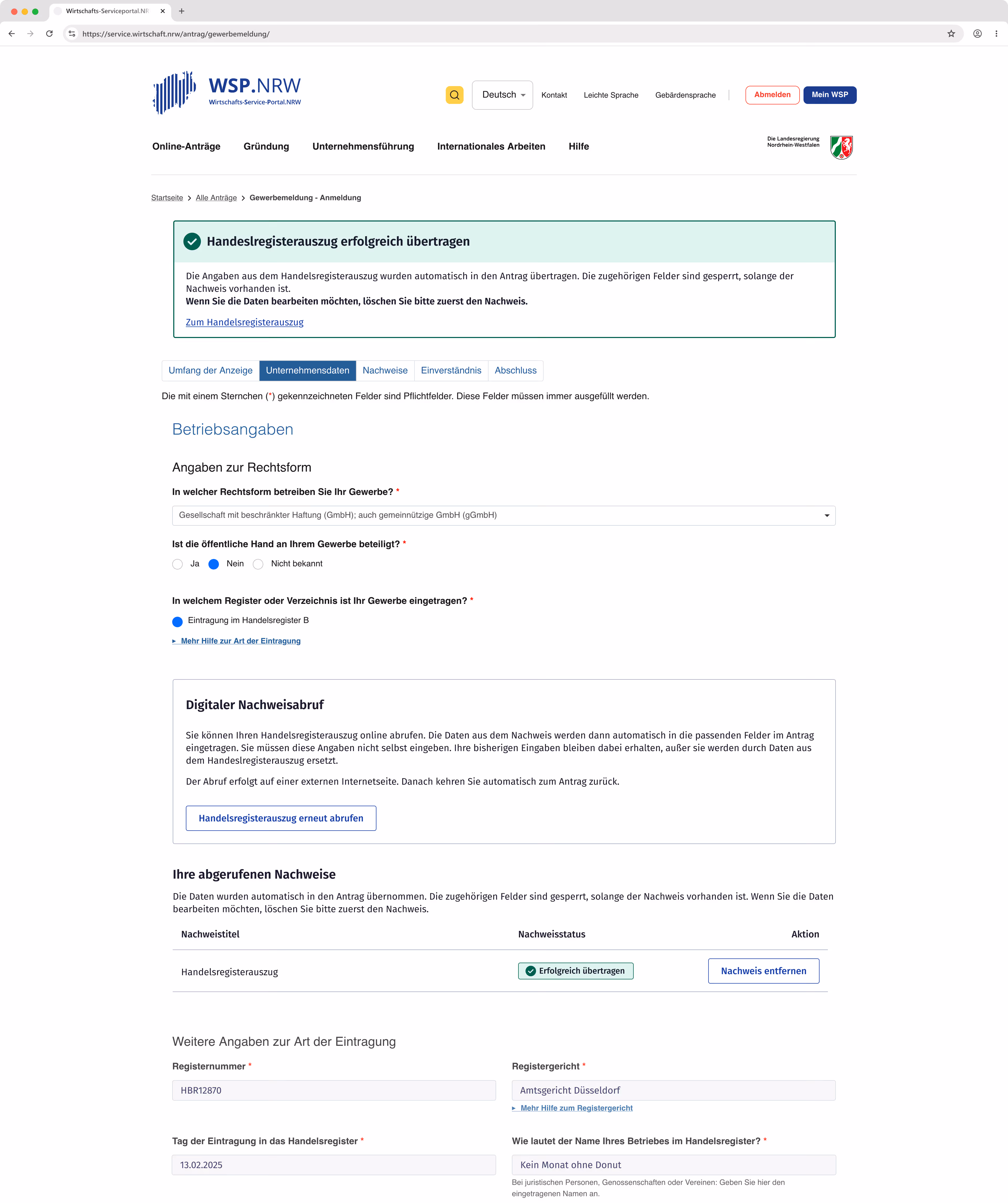
Upon transferring data to the form, a prominent green notification confirms that the transfer was successful.
This message links directly to the specific section containing both the evidence and the prepopulated fields.
In usability testing, the green notification was immediately recognized, and participants expressed satisfaction with the process.
Error Handling
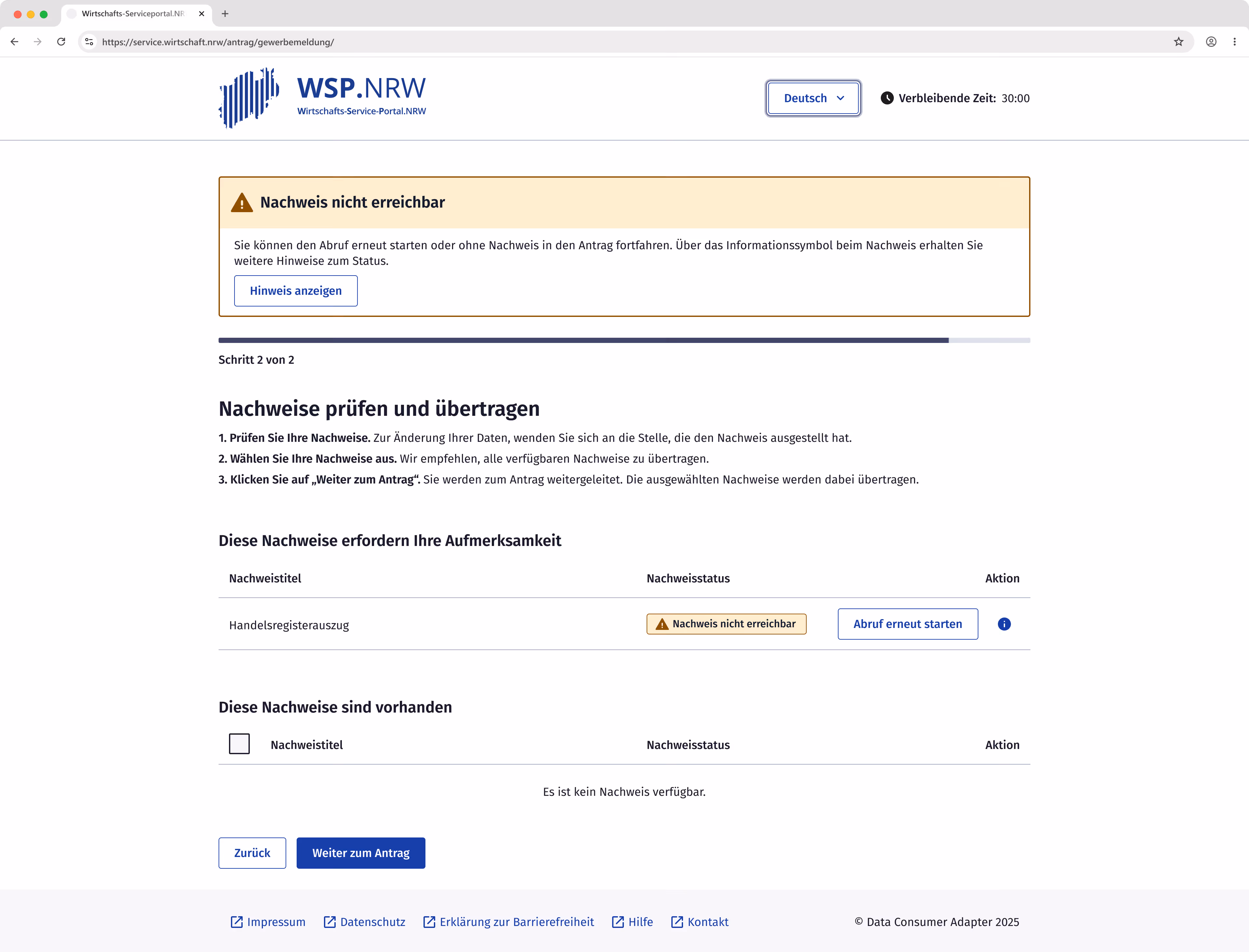
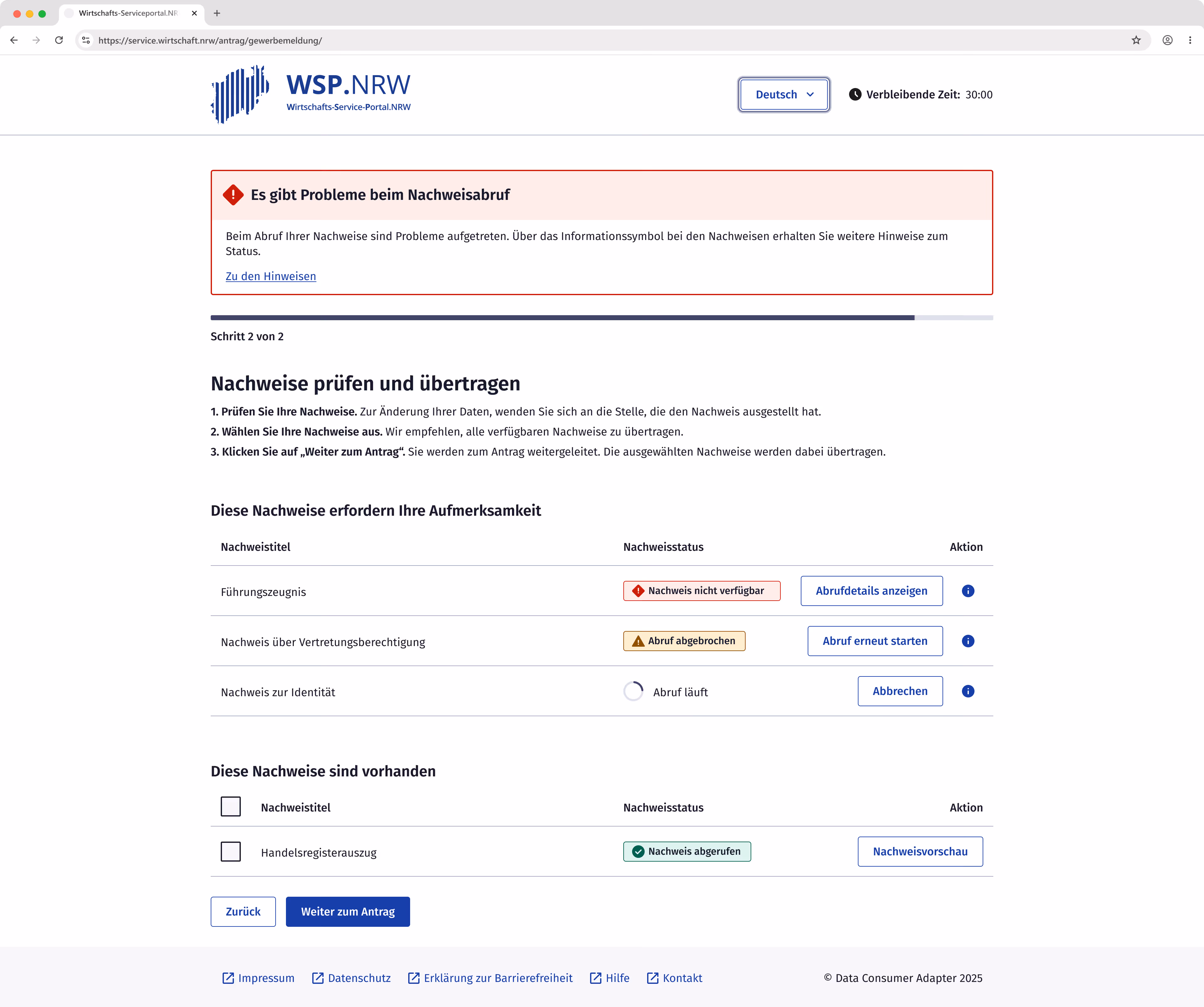
Various errors can occur while loading evidence. Since multiple documents are retrieved in parallel, they may display different statuses simultaneously.
To avoid mixing successfully retrieved evidence with error messages, these were visually separated into two distinct sections.
The colors of the badges correspond to the colors used for the error messages.
The second usability test revealed that users read neither the error messages nor the badge labels in detail, but instead react immediately to the color coding.
Consequently, red was reserved exclusively for "terminal" errors where no further actions are possible. In contrast, yellow and blue were used for errors that can still be resolved by the user.
Help and actions
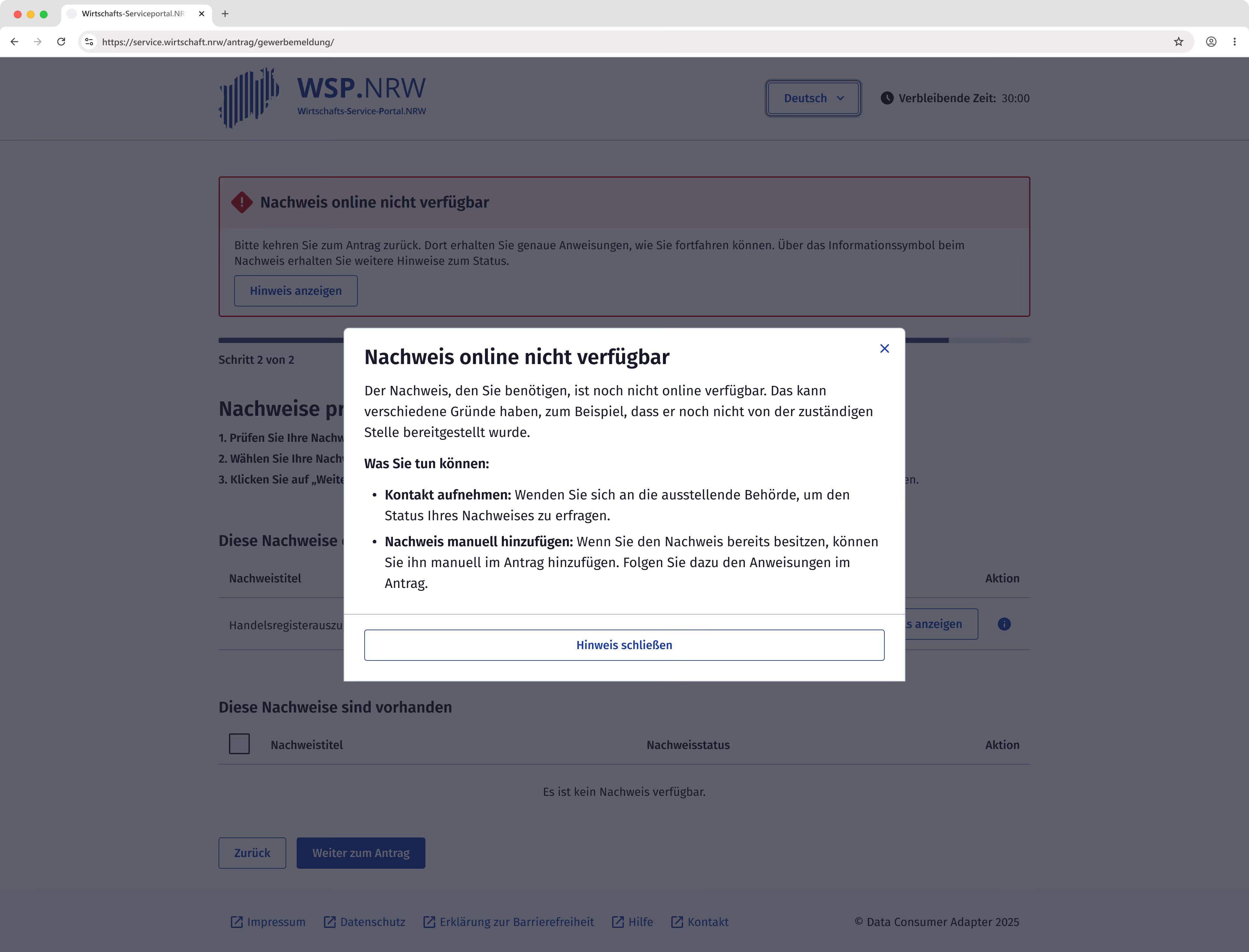
When errors occur, a global error message directs users to context-sensitive help, providing specific suggestions based on the error type.
For a single error, users can access this help directly from the message. If multiple errors occur, users are guided to the dedicated error section. This jump-off point allows for easier navigation via keyboard and screen readers.
For errors that are not yet "terminal," users have also access to actions such as "Restart retrieval."
In usability testing, the context-sensitive help was rated positively and met user expectations; however, the actual content of the help text received criticism.
Due to the current architecture, the DCA receives only limited information from the online service or the evidence itself, causing the guidance to remain vague. This was particularly evident with instructions such as "Contact the issuing authority." Users were unable to identify which specific agency was meant or how they should contact them.
These findings suggest that further refinement of the architecture is necessary to deliver an optimal user experience.
Conclusion
By combining KERN design standards with iterative user testing, we developed a viable MVP for digital evidence retrieval. While this initial milestone focused primarily on the "happy path," the testing phase provided essential groundwork for managing multiple evidence retrievals and handling system errors.
However, the transition to a production launch will require addressing several key areas for improvement identified during the project:
- The transition from the application to the DCA is a critical friction point. It is vital to ensure that users do not overlook the jump-off point. Future iterations should include a comprehensive overhaul of the business registration form itself, as the original application already demonstrated poor performance during usability testing. Furthermore, it must be critically assessed whether a generic adapter that requires a detour from the online application remains an acceptable long-term solution for a seamless user experience
- Error messaging and context-sensitive help need to be far more specific. Vague instructions that simply point users back to the application only shift the burden to the application providers. Because budget constraints often stall necessary updates to these forms, the user experience ultimately suffers.
- Previous usability tests were conducted exclusively with internal participants. To ensure the platform is truly robust and inclusive, further validation with external, independent users and individuals with disabilities is essential to meet both usability and accessibility standards.