Training software for patients with neurological disorders
Project background
Neurological conditions, such as strokes, frequently lead to cognitive impairments.
Rehabilitation focuses on the targeted recovery of these affected brain functions through specialized training.
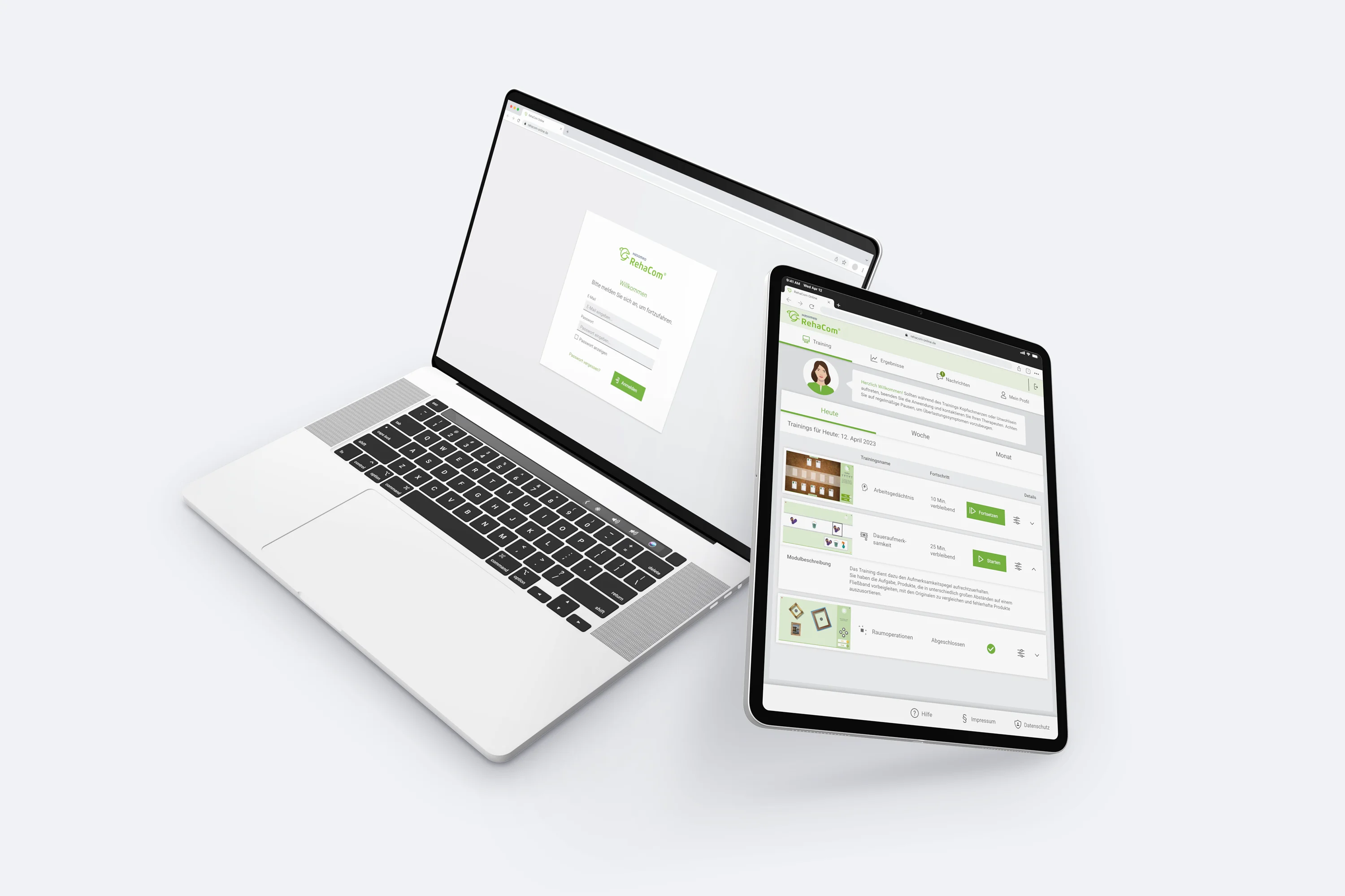
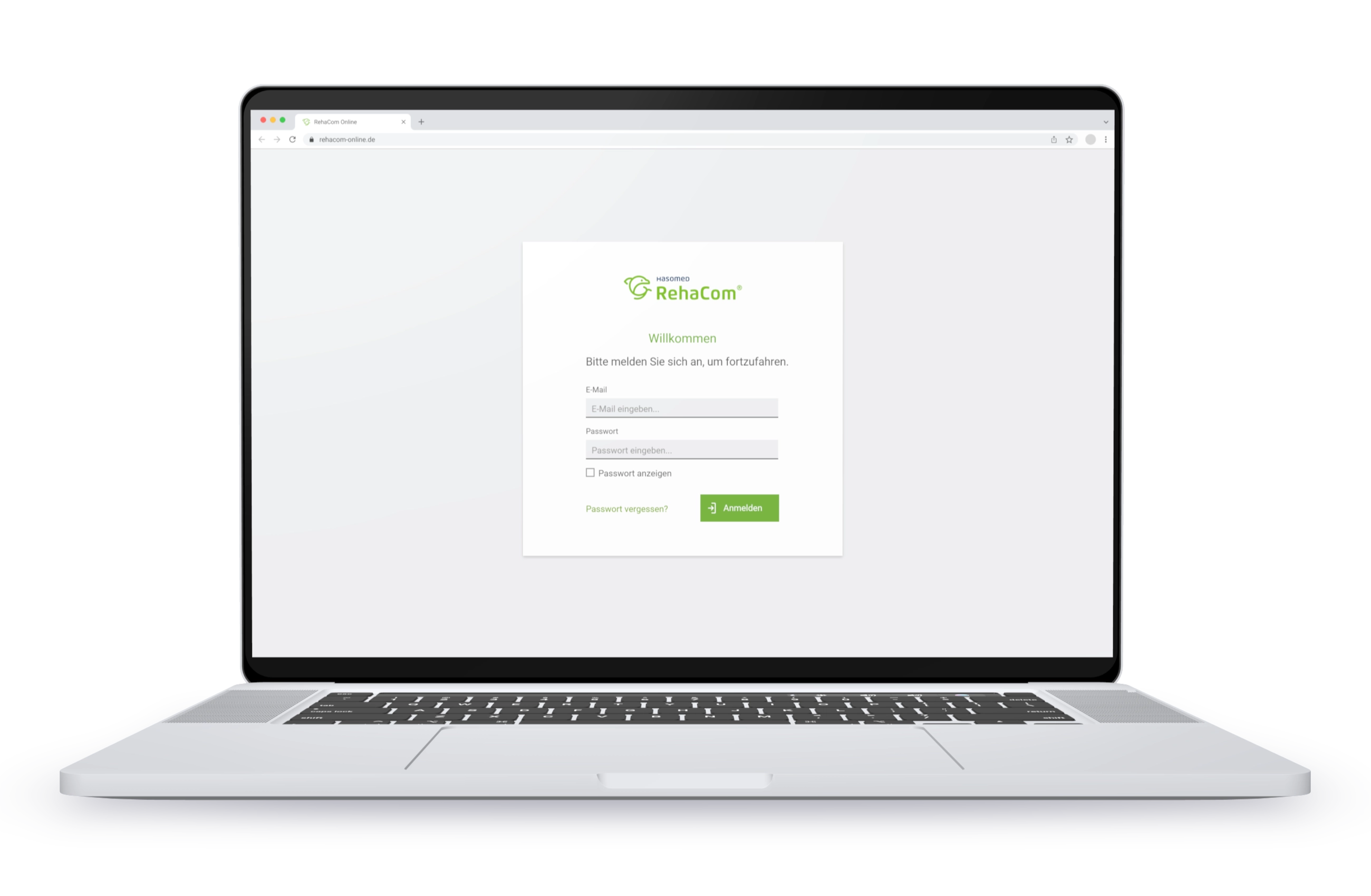
RehaCom® Online is a digital therapy platform for computer-aided cognitive rehabilitation. It is designed to support a seamless recovery journey: from supervised sessions with specialists in clinical settings to independent, flexible training for patients at home following their discharge.
Project goal
Before the market launch of RehaCom® Online, the existing user interface for patient training was to be further optimized.
Context
For effective rehabilitation following neurological diseases, it is essential that patients train the affected areas frequently and regularly. This consistency is typically guaranteed during inpatient clinical stays. However, after discharge, gaps in care often arise as patients may not immediately secure an outpatient therapy placement.
RehaCom® Online closes this gap by enabling patients to continue their training independently after leaving the clinic.
Throughout its development, RehaCom® Online underwent scientific studies and usability tests with both patients and supervising specialists, such as neuropsychologists.
Based on the findings, it was determined that the user interface required further optimization for independent use by patients.
My role
As a UX designer, I worked closely with other UX designers, developers and managers to optimise the product. My tasks included:
- Preparing, conducting, and evaluating interviews and surveys.
- Creating personas.
- Supporting and monitoring a beta test.
- Conceptualization: Creating flowcharts, wireframes, and low-fidelity prototypes.
- Implementation: Developing high-fidelity prototypes and mockups.
- Building and maintaining the associated design system.
- Creating assets for the interface.
Research
Interviews
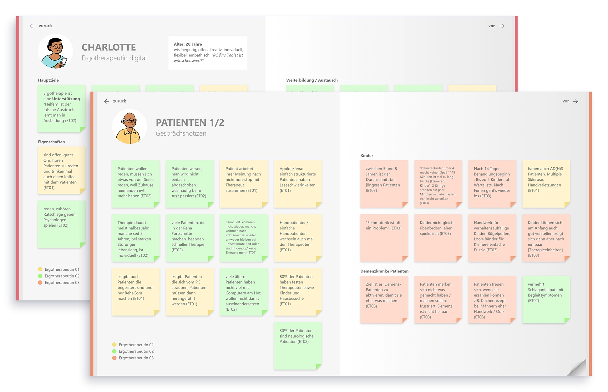
Although initial research findings from previous studies were already available, we decided to conduct further interviews to develop an even deeper understanding of the needs of both specialist staff and patients. In total, we conducted three interviews with occupational therapists, which included a site visit to a practice.
We then structured the interview topics into an interactive book prototype that was shared company-wide.
The interviews provided the following insights for the redesign:
- Not all patients train to improve their skills; for example, patients with dementia may train specifically to maintain their current abilities. Regardless of the goal, providing a sense of progress remains essential.
- Patients with mental health conditions also utilize RehaCom® Online. For this user group, a clearly structured training plan is particularly important.
- Patients with neurological conditions are often middle-aged or older, meaning they face both age-related and disease-related limitations. Since vision or motor skills may be impaired, the interface must remain highly accessible and easy to operate despite these constraints.
A beta test was conducted to evaluate the product under realistic conditions and gather deeper insights from both specialists and patients. Over a three-month period, neuropsychologists and occupational therapists across various facilities tested RehaCom Online extensively. The UX team supported this phase with in-depth interviews and feedback sessions, resulting in more than 40 individual discussions.
The following insights were gained from the testing phase:
- It is crucial that patients maintain the appropriate training intensity by avoiding both over- and under-exertion while adhering to their therapist’s prescriptions, especially after being discharged.
- Patients require constant feedback on their performance. The presentation of results must be easy to interpret and explain for both therapists and patients.
- Performance levels and goals vary significantly between individuals. From a therapeutic perspective, comparing patients against one another is not effective; therefore, feedback should be personalized to the individual's progress.
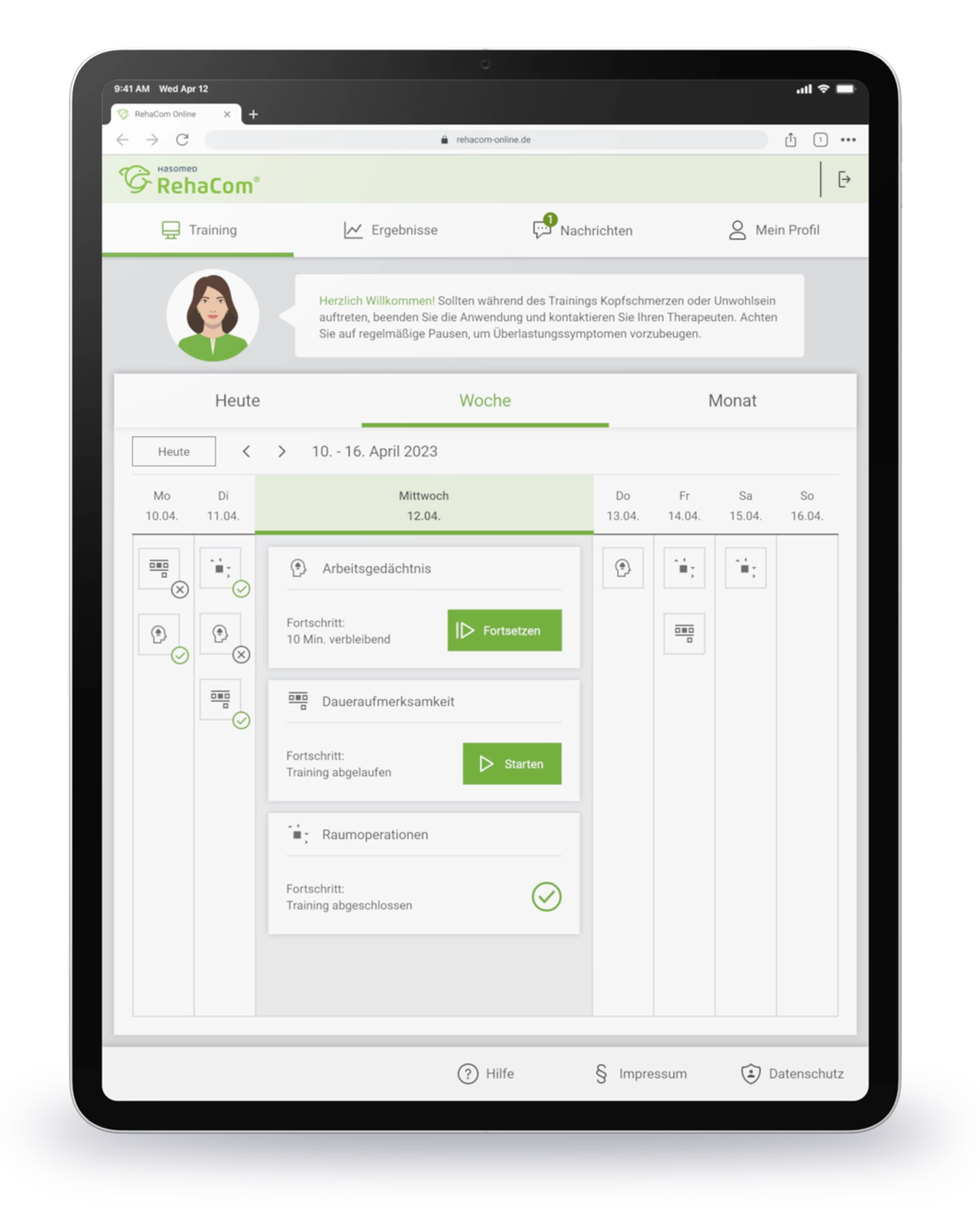
- Computers are not always accessible in clinics or patient homes. Tablets are increasingly becoming the preferred hardware for training sessions.
Re-Design
- Only the names of the exercises are displayed. These names are often complex and have low recognition value for patients.
- Progress is shown as a percentage, even though the training sessions are based on time.
- Under the My Day menu item, training should only be displayed for the current day. However, the interface currently offers the option to view other days, which leads to confusion among patients.
- The start button for the training is difficult to recognize due to inconsistent colors and its small size.
- Exercises now include a small preview image and an icon alongside the name to improve recognition.
- The progress indicator no longer shows a percentage; instead, it displays the planned or remaining training time.
- The interface now only displays training for the current day. A weekly and monthly view is available for those who need an expanded overview.
- The start button has been significantly enlarged and now indicates whether a session is being started for the first time or is being resumed.

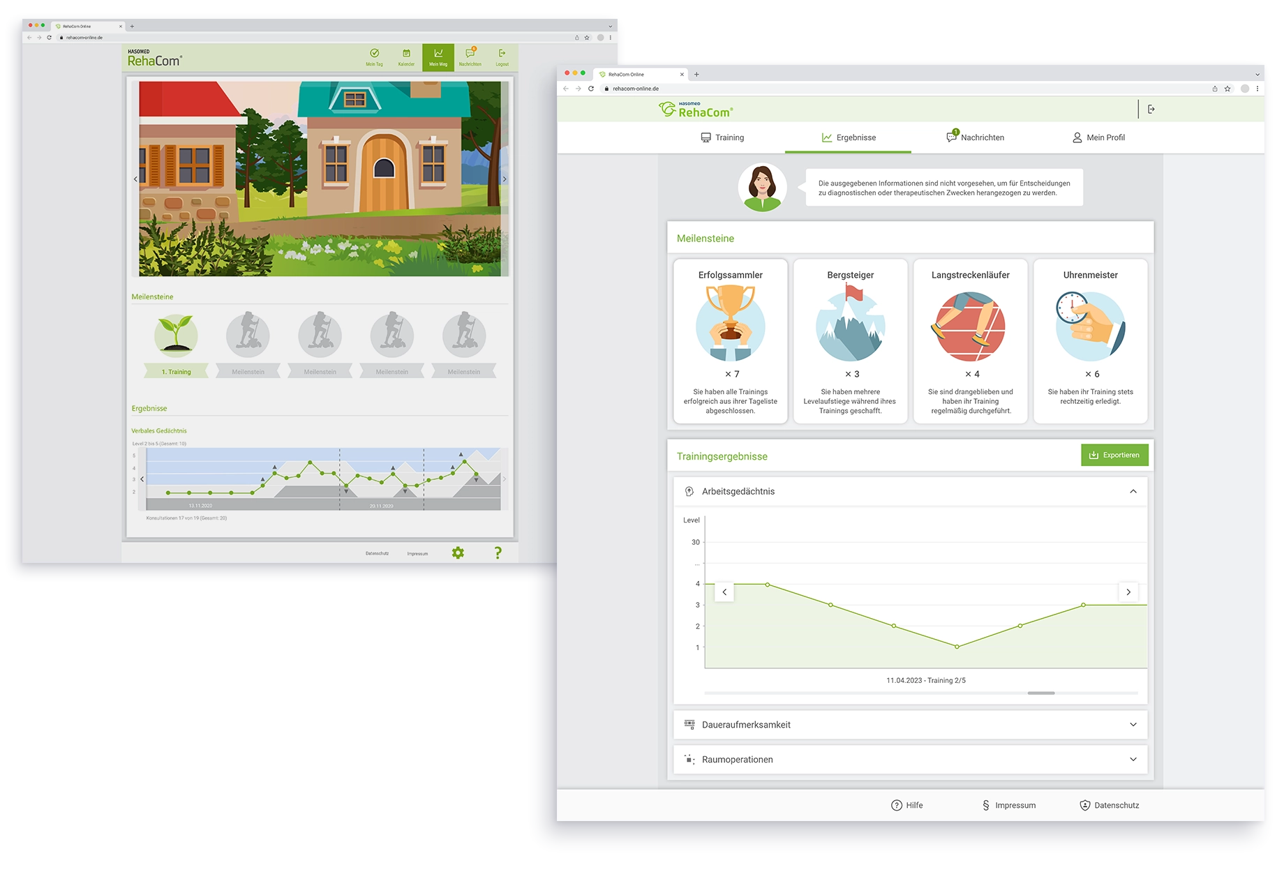
- Patient progress was represented by an avatar moving along an illustrated hiking trail. However, the illustration had a fixed length, making it unable to accommodate longer training periods.
- Training achievements were rewarded with milestones, but the criteria for reaching them were not clearly defined or visible to the user.
- The results graph used various colors to symbolize a path, but the representation was visually cluttered and difficult for both therapists and patients to interpret.
After
- The trail illustration was completely removed. Because progress is highly individual and not comparable between patients, the focus was shifted to new milestones featuring a simple counter.
- The new milestones address common challenges that patients face during their training periods. This allows patients to experience consistent success simply by completing their prescribed training sessions.
- The results graph was visually streamlined and redesigned to align with the rest of the interface, ensuring better clarity and consistency.
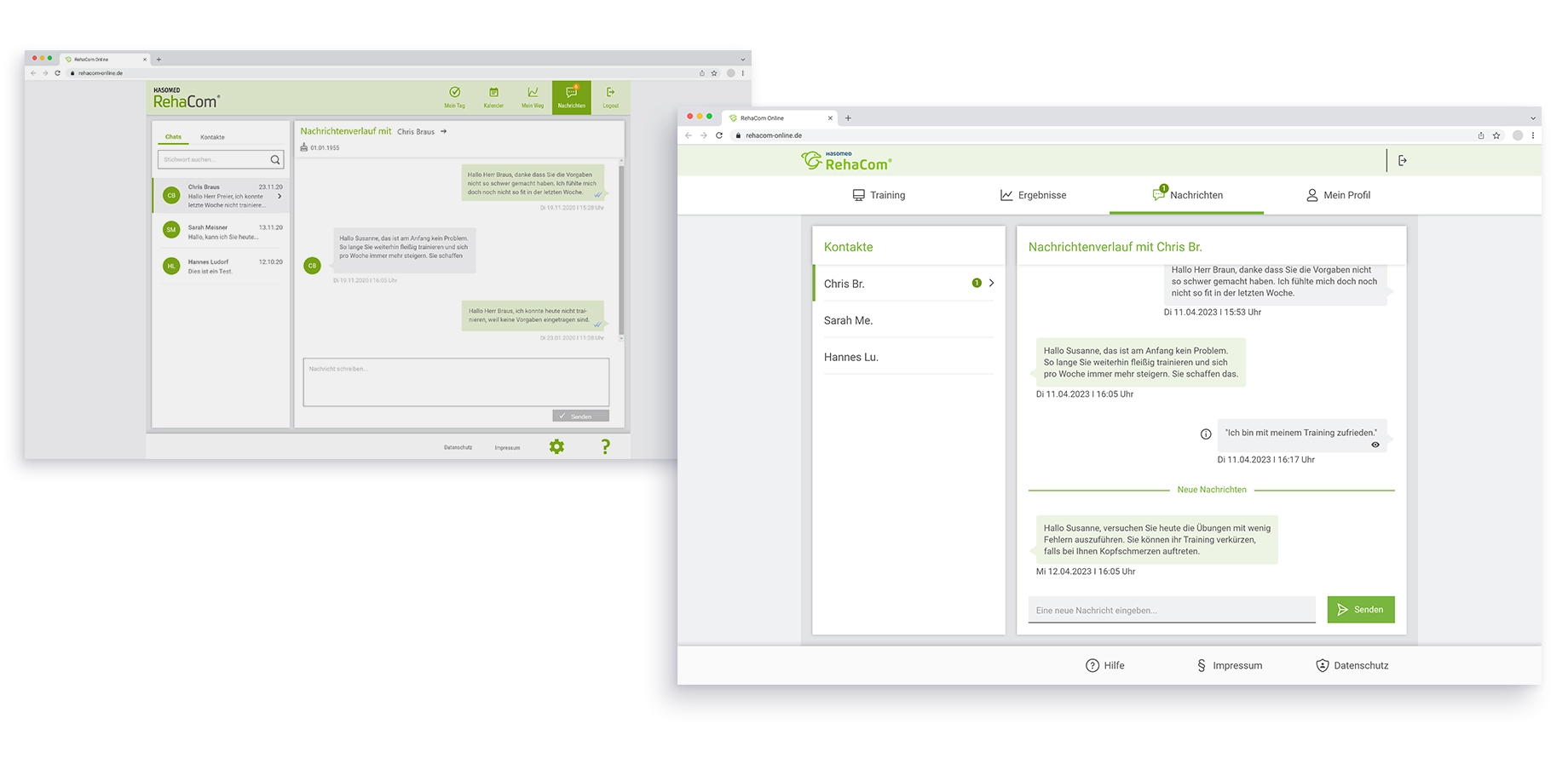
- The interface was divided into separate sections for chats and contacts. However, because patients only have their therapist as a contact, this division was unnecessary.
- Non-essential details, such as the account icon next to the therapist's name, made the interface feel cluttered and were distracting for patients.
- The unnecessary division between chats and contacts was removed to simplify navigation.
- The chat interface was updated to align with the rest of the redesigned system. By removing the account icons and focusing on a clean text-based layout, we created a more straightforward and intuitive experience for users.
Device Optimization
To provide both patients and therapists with maximum flexibility, RehaCom Online was optimized for tablets as part of the redesign. We intentionally decided against a smartphone version, as small screen sizes are insufficient for ensuring effective cognitive training.
Project outcome
The project resulted in a comprehensive redesign that translated the complex requirements of cognitive rehabilitation into a modern interface. By closely integrating research findings with design execution, we were able to develop a solution that maintains therapeutic quality while significantly improving usability for patients.